COMPARING BOOKINGS sucks.
Users begin their experience on hotel booking websites with open curiosity. But as they search and select options over multiple visits they have to scrutinize details and fatigue in the process. I created a streamlined application to reduce the intensity of decision-making.
PROTOTYPE


DEFINE THE CHALLENGE
FIND AN edge.

User survey results in April 2023 found a market dominated by Airbnb + Booking.com.
User surveys revealed that Airbnb and Booking.com are South Africa's favorite booking platforms. Did we even need another booking application? To answer this question, I identified 3 goals:

Understand the strengths of existing applications + match the end user's enjoyable experiences.
INITIAL GOALs
Find an opportunity that is hiding in plain sight to design an application that has an edge.
Unearth and capitalize on the mistakes of industry heavyweights.
MY role
User Experience and User Interface Design.
Case Study for the User Experience Design Institute, accredited by the University of Glasgow.
Time-frame: 6 months
Phases: Research, Analysis, Design Conception, Design Iteration, Hand Over.
Details: Including UX copy.

WHY is AIRBNB sexy?
Research participants emphasize how they favor Airbnb. The layouts dynamically expand and contract based on the information being presented. Organizational Elements contribute to a cohesive product experience: like the structural columns and beams of a house, they work invisibly to optimize the website's layout. This is pronounced on desktops where large screens require careful management.
RESEARCH
ORGANIZING LAYOUTS.

A sketch analysis of Airbnb layouts showing how elements like headers, side margins, pop-ups etc. create a dynamic application.

I applied these elements of pop-ups (4), in-image scrolling (5) and header (1) to the design of my own desktop application - seen here on the homepage.
IDENTIFYING PATTERNS
Repeating patterns surfaced in the research: principals that went on to guide the final product's design. While I give a specific example of where a pattern was most prominently displayed (a piece of research or analysis), I always triangulated my findings across research methods.

RESEARCH + ANALYSIS
stop overwhelming people.
A lack of visual hierarchy in Booking.com and Africamps (an abundance of text, labels, specialized categories, long pages) makes booking feel like a chore. Users get overwhelmed when the visual language of these elements changes. They prefer a simpler, paired-back website with fewer features.
" It's a bit overwhelming, [...] there are so many different things to consider "
Competitive benchmarking 5 applications and cross-analyzing them revealed that booking applications lack visual hierarchy.
RESEARCH
LOCaTION, LOCATION, LOCATION.
Where the accommodation is located is of utmost importance to the user. The map is a powerful tool to communicate this: users want to know what is nearby (sights, activities, coffee shops, supermarkets, transport).
"I have Google Maps open in a new tab to get more information on the area"
Usability Interviews consistently showed how users were drawn to the map and the information they revealed.
RESEARCH
IMAGES HOLD OUR attention.
Visuals should be capitalized on to keep people engaged. After all, images are the best way to show the user what they are there to do: get excited about booking a holiday! Images are used in a user's fact-finding mission to check whether the amenities described are true.
" It looks lovely - all those pictures make me want to go there"
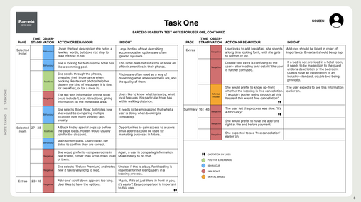
Taking detailed usability interview notes allowed me to reflect on the consistent emphasis users put on images.
ANALYSIS
a holiday EXPERIENCE, not a room.
Booking Applications have the potential to help users consider the kinds of experience they'd like to have on holiday. You can go beyond the utilitarian process of booking a room - which is why I developed Adventure Categories (Mountains, Lakes, Waves, Birding + Climbing).
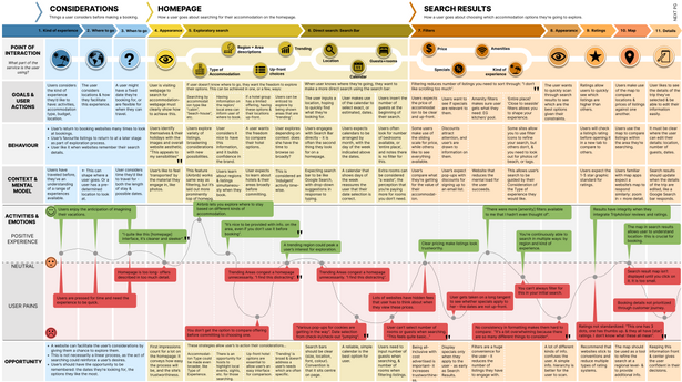
The customer journey map exposed the user's considerations of the kinds of experiences they'd like to have before they begin booking.

AHA! MOMENT
I simulated a business use-case discussion where I presented my research and prototype to a local start-up. I explained that when users are done browsing their options, they move into decision-making and pay attention to detail, comparing search results across multiple stages in the process which is tedious.
This led me to develop features like 'Favorite', and 'Compare' to save users time.

concept
THINKING CRITICALLY.

Taking a moment to step back and think critically about the booking process allowed me to develop key features that would give the product a competitive edge.
CONCEPT
INTERACTION DESIGN.


Early, low-fidelity screen designs explored how Favourites, Comparison Features + Trips could be woven into the information architecture.


DESIGN ITERATION
COMPARISON FEATURE.

Design iterations from low to high fidelity of the Compare feature (left to right).
OOPS! MISTAKE.
A usability interview of the prototype revealed an oversight in my design process...
CONCEPT
ADVENTURE CATEGORIES + MAP
"The company is called 'All-In Adventure Group', but I can't see anything about the adventures I'll be going on?"

In early concept sketches I emphasized Adventure Categories and The Map - putting users in relationship with the potential of their surroundings. But as I developed the prototype, I'd lost this priority.
DESIGN ITERATION
ADVENTURE CATEGORIES + MAP
Early prototypes show expectations of Adventure on the homepage, but users didn't know what that meant, and how it could shape their experience.

I identified Adventure Categories to make it easy for users to understand them [1] and enhanced the map to help users understand their proximity to adventure [3, 4].
BUILD TRUST
A user's trust hinges on the upfront presentation of information and the execution of detail. Make them feel safe in a process where they are spending money.
RESEARCH
PAIN POINTS.
"If there aren't many photos it looks like they've got something to hide".
A detailed affinity Diagram revealed pain-points that reduce a user's trust: not enough photos , knowing who the host is, up-selling before completing a booking, company affiliations arousing suspicion.
DETAIL DESIGN
DEVELOPER NOTES.
Details of the price breakdown, connection to the host's profile and many photos aim to garner the user's trust. Photographs are used twice in the layout to remind the user of the emphasis on the booking experience.


An example of detailed notes to the developer, specifying interactions, response times, errors and connections.
Next Project


